NUGO: Husky Dining Services
TIMEFRAME | ~4.5 weeks
ROLE | UR & UX
TEAM SIZE | 3
01 | SUMMARY
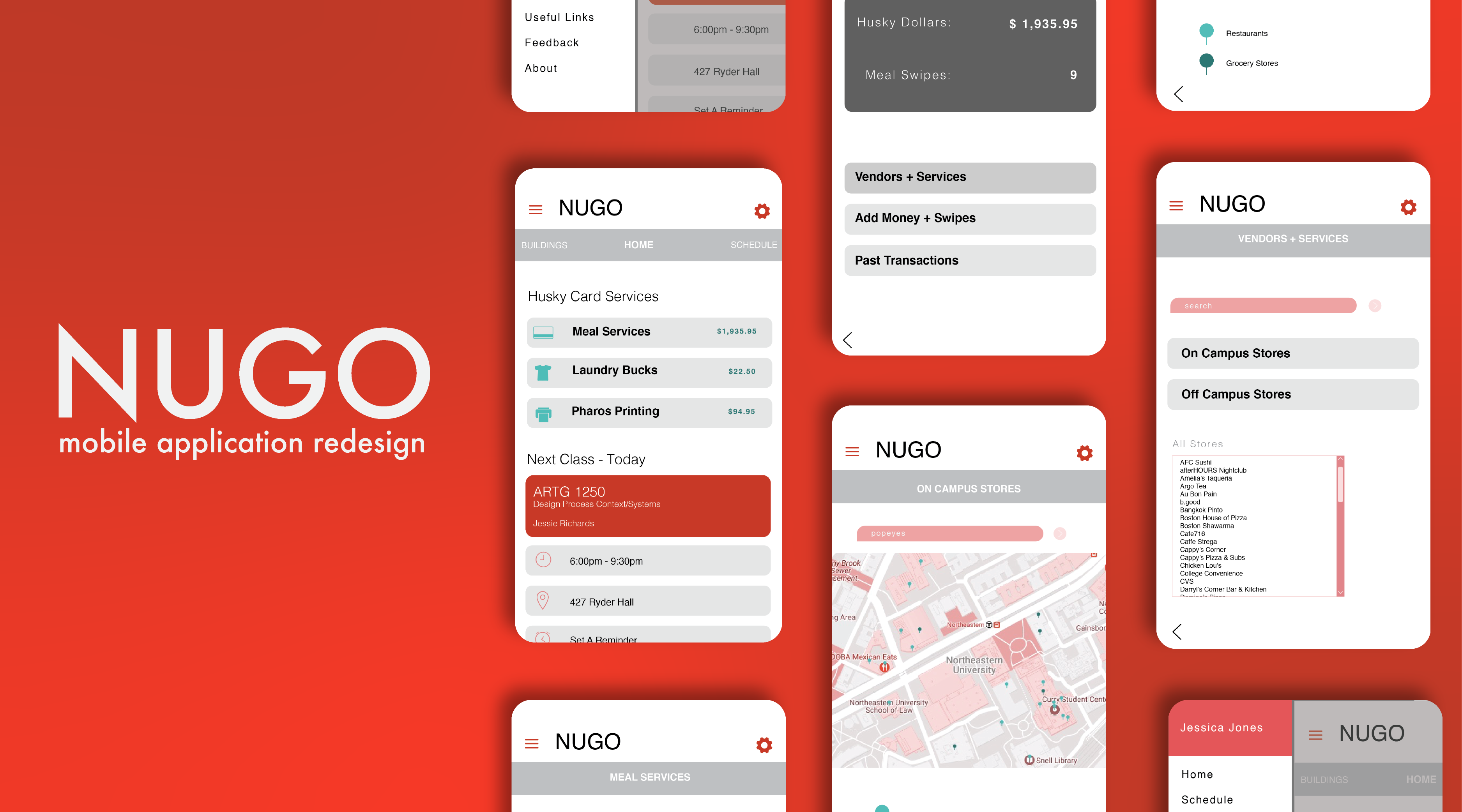
NUGO is an application for Northeastern students where they can view student information like
class schedules, husky dollars, grades, and more. This project focused on adding and redesigning the dining
section of the application.
02 | PROBLEM
Northeastern students feel confused about how and where they can use their Husky Card. They must navigate through
multiple sites and sections of the Northeastern Dining websites to find accurate Husky Card Services information.
03 | SOLUTION
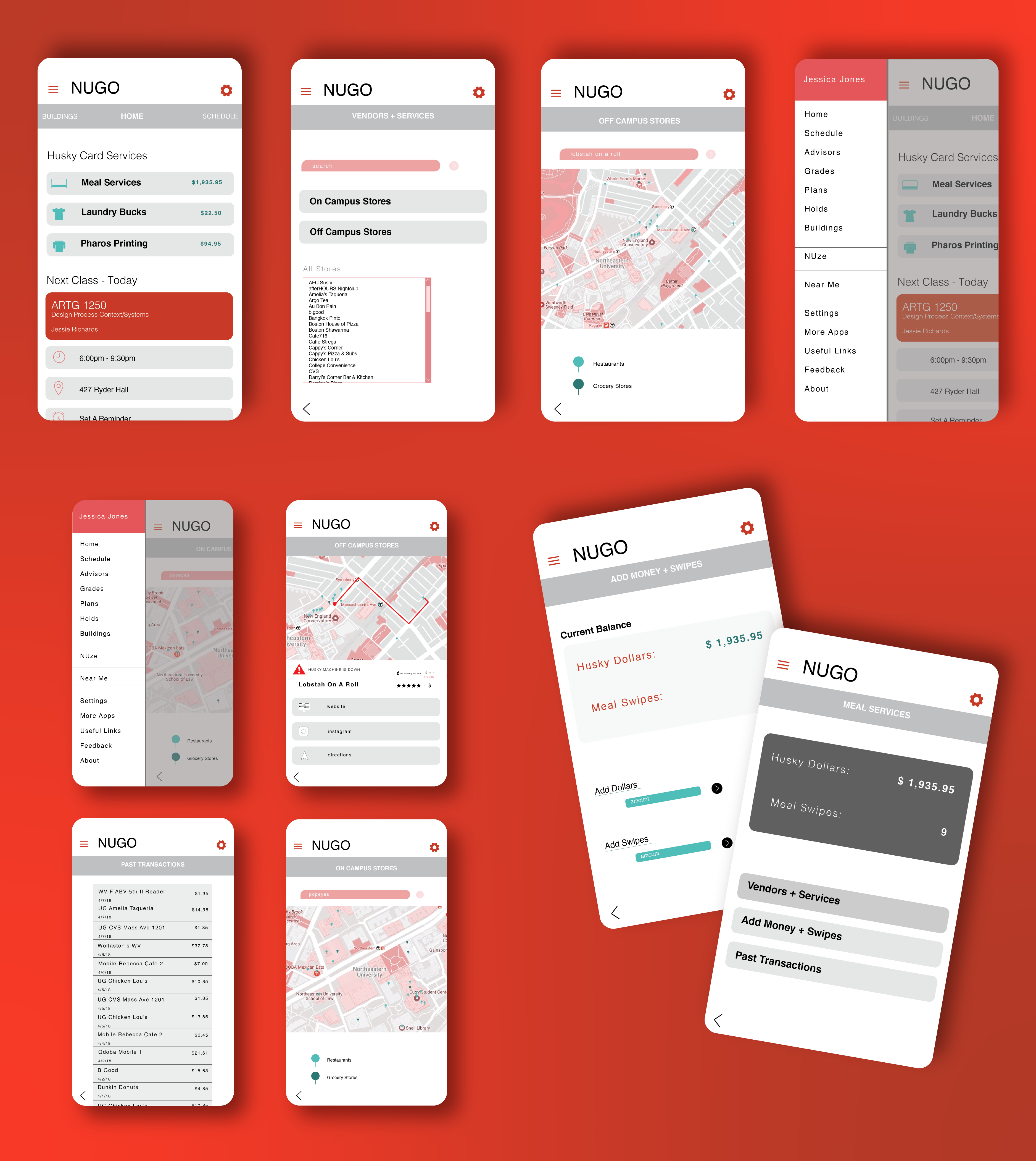
Expanding the Husky Card section on the NUGO app that allows students to access information
on their Husky Dollars, Dining Dollars, meal swipes, and dining locations. Students have access to maps and lists
that display where individuals can use their dining swipes and credits. Additionally, Students can receive
notification of updates, changes, and alterations related to Husky Card Services.
04 | RESEARCH
Initially, we started by brainstorming what exactly we felt were the problems with the NUGO
application specifically concerning the Husky Card Services section. We completed an audit of the app and websites
needed to currently of find out Husky Card Service information in order to better examine and understand how the application
and its related site worked. The findings from this gave us some direction and context to inform our
user interviews. We conducted user interviews as part of the research process to gain a wide and unbias user persprective
on the application and the issues we found and wnated to fix. Before the interviews, we were focused on simplifying the process
of finding vendor information. After the interviews, users brought forth other related issues like updating card balances
and being informed of outages and vendor changes.
Application Audit | Key Findings
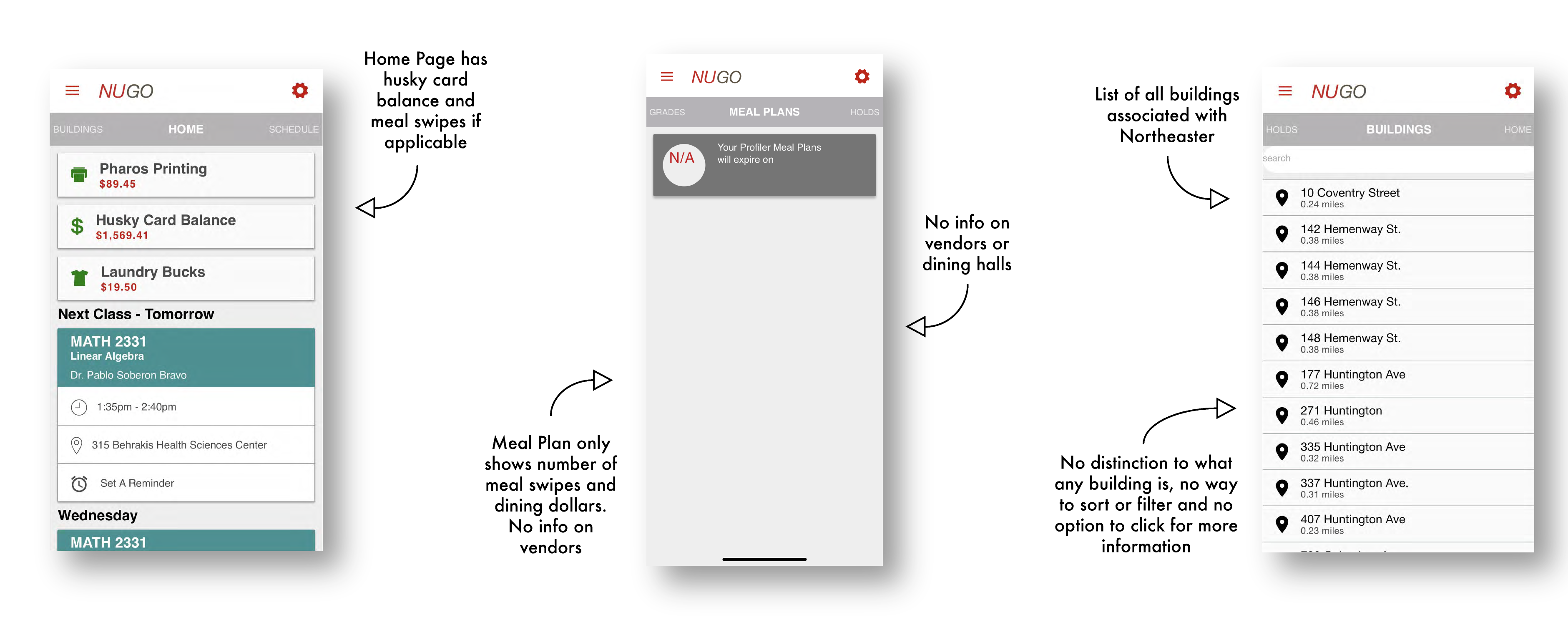
↳ Mobile application only has Husky Card and Meal Plan balance
↳ The mobile application has a list of on and off-campus Northeastern buildings but no map, navigation info, or
way to
sort/filter addresses, or specific location info other than building number & street name
↳ Mobile application has no dedicated dining/food related section
↳ The websites require navigating to multiple pages to find vendor and money reload information
User Interviews | Identified Pain Points
↳ Users didn’t know where they can use their card & which places took husky and/or dining dollars
↳ Users have to navigate through multiple websites to add money to their card
↳ Users never know when the swipe machine is down until they get to the register of an establishment
“I like using [my Husky Card] except, at Qdoba, the server is always down, and I never know
if I can use my card or not.” -Northeastern University Student
Prototype
Pain Point 01
Problem | User didn’t know where they can use their
card &
which places took husky and/or dining dollars
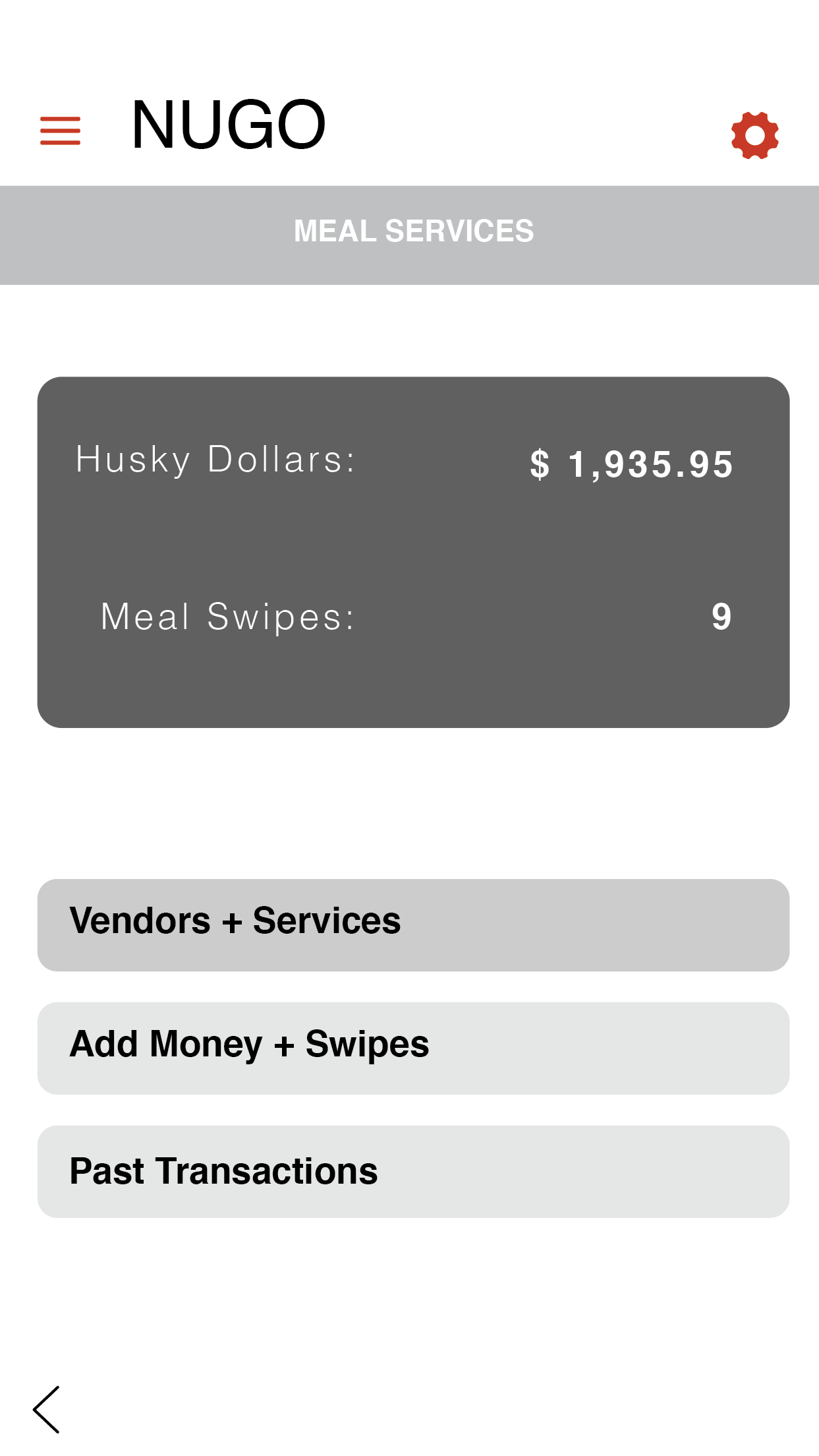
Solution | Dinning information was included under the
“Meal Services”
section on the application, all vendors who take Husky Dollars can be found. Users no longer need to navigate
to
a new website/application and can view all vendor info as well as have links to related info on the app.
Why |
This eliminated the need for users to navigate to one site to find vendors, another site to find specific vendor
information and who took what kind of dining value
Pain Point 02
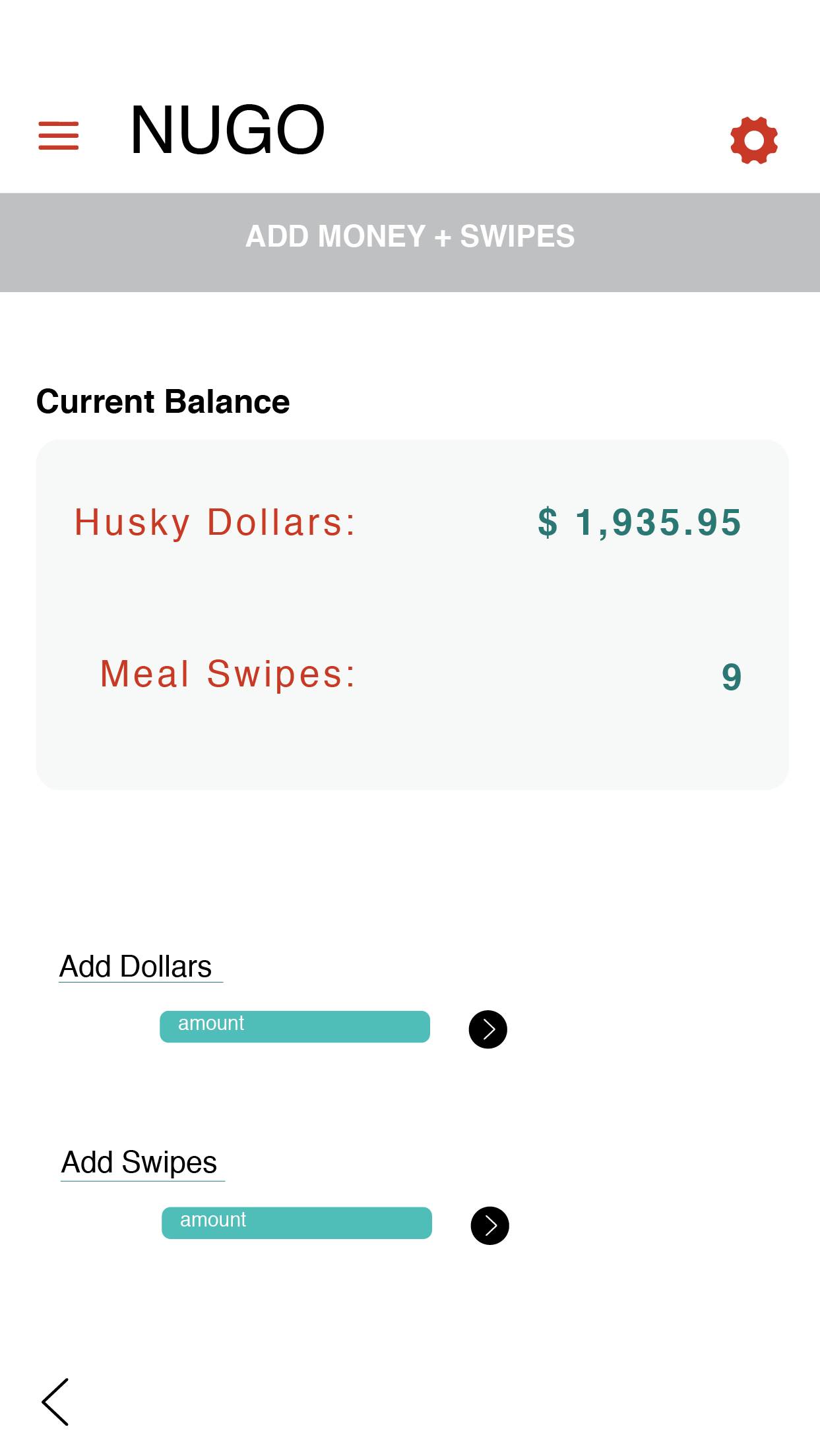
Problem | Users have to navigate through multiple
websites and pages
outside the application
to add money to their card
Solution | The process of adding funds was added to the application,
allowing users to add money in the app instead of having to navigate on the web through multiple
pages to the Universities' financial services website to add money, cutting down on the number of clicks needed to complete
the task
Why |
This simplified and centralized the process, eliminating the need of having to navigate on the web through multiple
pages to the Universities financial services site to add money, thus cutting down on number of clicks and time
needed to complete the task
Pain Point 03
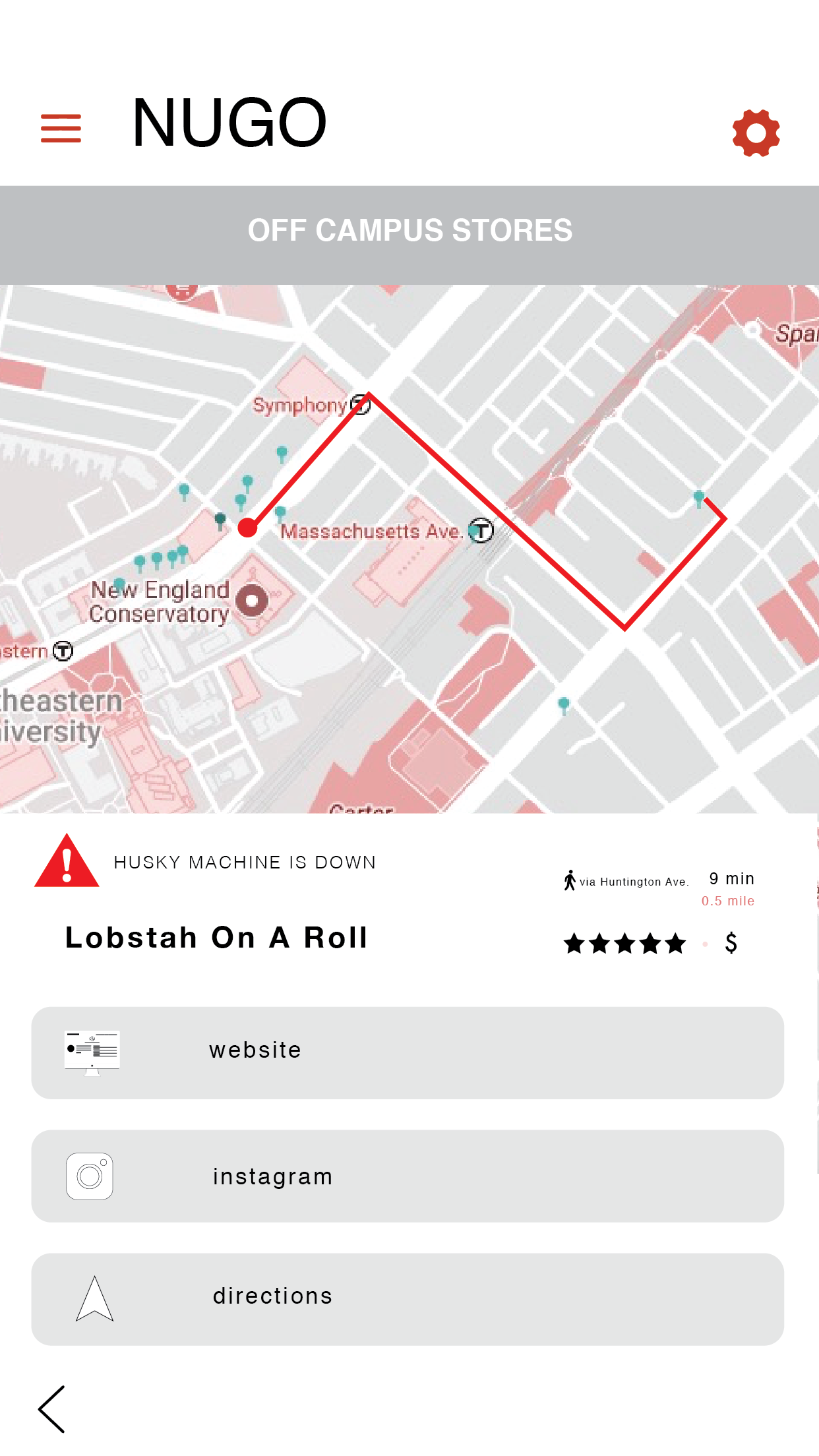
Problem | Users never know when the swipe machine is
down until they get
to the
register of an establishment
Solution | A clear visual indicator of complications
related to the establishment is now shown to users. Users can now see in real-time if a vendor’s card scanner is out of
order as well as get directions, price ranges, and other information
Why |
This solution as opposed to a warning pop up or push notification alert is less obstructive to the process and doesn’t
distract from the other information related to the establishment
06 | REFLECTION
Moving forward with this project, the next step would be to test the product against the
current application and methods as well as address any UI issues.
This project was a good opportunity for conducting a design audit of the current
product. Being able to examine the current process and solution informed not only our user interviews
but also our ideation process for developing our solution.
UPDATES, TESTING & MEASURING IMPACT
↳ Standardize and correct the UI and design system to fix readability and visual accessibility issues
↳ Run task-based user testing to see if the time it takes to complete tasks related to the pain points has reduced
↳ Track student spending before and after implementing the updated section to look for an increase in
spending
↳ Track vendor profits and patrons to see if users are visiting vendors more and if they are spending husky
dollars while there
06 | THANKS TEAM!
Ayanna D, Claire G, & Thandiwe Tembo
made by hand & powered by Github Pages
![]()